Search anything on the Google and thousands of websites popup. You must have visited a large number of websites till date, so do every student has. Some are eye-catching, some are moderately attractive and a few are awful. Did you spend handsome amount of time in those horrific website design or will you again visit them? A potential “no” will be the answer for sure!
If you look from the company’s point of view, a poorly-developed complex-structured website fails to draw traffic. People, today, are critical about what they are watching or what they are reading. If the platform or the content isn’t up to the mark, viewers leave the site straight away.
So, what are the substantial website design conversion ideas? That’s one common essay topic for Management or Technology students.
Not everyone is aware of the website design hacks. A bit of instruction on this subject-line and this article offers exactly the same. Take a close look at these DIY hacks that’ll ease your website design modifications.
Quick Tips: Time to Make Your Website Smarter and Tempting
Everyone, who is visiting the website, will not necessarily become a buyer. In fact, a larger count leaves the site after pondering over the goods and services. In a recent study it has been found that the average website conversion rate is 2.35%, which means only two to three among hundred visitors are potential buyers. Here’re some state-of-the-art ideas to increase this conversion rate.
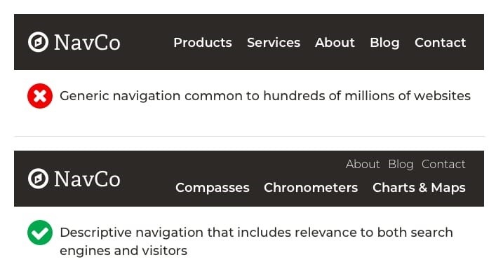
1. Seamless Navigation Is the Key to User-Friendly Websites
Time is running faster – everything should be at the fingertips. In today’s date, no one likes to spend times on searching inside the website. Remember that the navigation bar is not for fashion; it has a purpose of its own. Either go for a drop-down list or make small sections on top of your website for highlighting your major services and product categories. Too many of them can again confuse the visitor. So, don’t cluster the navigation bar with all the minor classes or interposing product-lines. Keep it seamless but useful.
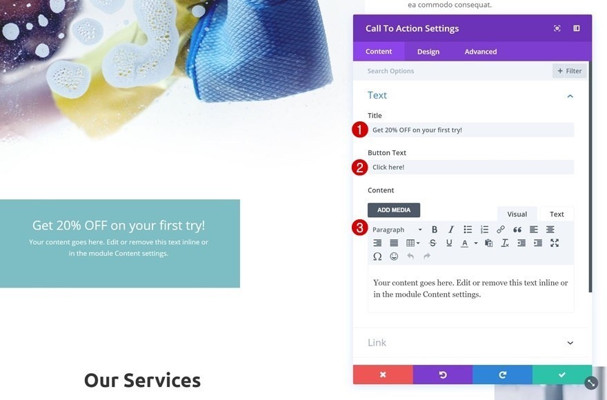
2. Animated Ctas And HD Visuals Reflect A Classy Web Design
If you check the best websites for selling electronic goods or if you check the website design of bigger brands like Apple Inc. or Microsoft, you will notice one thing in common and that’s the visual of those websites. Companies that are leading the digital market never choose free templates as their website design.
In addition, you will find high-definition visual contents like infographics, product-images, service-promotion-videos, and more such quality stuffs all over the website. This happens to steer eyes faster than a blunt website design page content. Animated “call to action” button is the latest trend among web developers. Instead of text-CTAs, if you add button-CTAs, both clicks and revenues will increase.
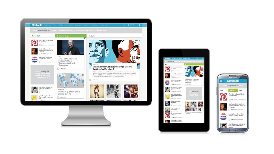
3. Focus on Mobile-Responsiveness Rather Than Desktop-Browsing
Earlier, people used to access the websites from desktop but now it has shifted to mobile-browsing. Smartphones offer a high-degree of flexibility i.e. you can access the website from anywhere and anytime. So, website developers should concentrate more on mobile-responsiveness to reach more traffic. If the website design consumes higher loading-time in mobiles or the pages are partially loading in the smartphones, optimize the site immediately. Otherwise, your website impression will drop followed by a lesser reach and no-returning visitors.
In the world of digitization, don’t let your websites experience poor traffic-flow. Implement these DIY ideas to boost the conversion rate.